Another look at my gamer data

This slideshow requires JavaScript.

I’m still wrestling with R and wishing I was a natural (or maybe just a more experienced) coder. Everything takes so long to work out and to actually do. Last time I shared the results, I was just looking at the top-line data that iSurvey shares. This time I’ve downloaded the data and sucked it into R, the command line based stats language.

I start off looking at the basics. What is the size of my DataFrame (as it’s called in R)?

> dim(ghb)
[1] 193 89
> nrow(ghb)
[1] 193
> ncol(ghb)
[1] 89

There we go, its 193 by 89, or 193 rows by 89 columns. Now more that 200 people actually responded to the survey, but not everybody completed it, so to keep things simple, I only downloaded those who had completed it. But I discovered there were still gaps in the data, and here’s a case in point:

The first question I asked was a list of games, against which respondents could select from six categories:

When I composed this question I had two intentions in mind. Firstly, to offer a simple question to ease people into doing the survey, so they would be less challenged by the more esoteric questions I attempted later. Secondly, I just wanted to get an idea of the participants awareness of a number of different games and types of games. Thus the list of games was somewhat esoteric, with games I knew were popular, and games I’d only come across through my study. This is how that list appears in R:

[12] “Minecraft”
[13] “Red.Dead.Redemption”
[14] “Papa.Sangre”
[15] “I.Love.Bees”
[16] “Elder.Scrolls..Skyrim”
[17] “Cut.the.Rope”
[18] “Zombie.Run”
[19] “World.of.Warcraft”
[20] “The.Sims”
[21] “Just.Dance”
[22] “Ingress”
[23] “Dear.Esther”

I mentioned how the games compared in my earlier post. But since composing the survey I realized it should be quite easy to convert the categories into numbers and and total up individuals’ awareness of these games into a notional continuous numerical “game awareness score.” That might prove a statistically useful measure of a question I purposefully didn’t ask (which might have been: How interested in games are you? Not at all—–>Pro Gamer) against which I might be able to correlate certain play preferences, maybe even proving or disproving the oft-heard cry “Real gamers don’t play Angry Birds“! (An aside – I like this comic representation of a similar argument).

So after some frustration I come up these two lines of code for R:

ghb$ludic.interest <- round(rowSums(ghb[12:23])/72, 2)
hist(ghb$ludic.interest, col = “firebrick3”, xlab = “Notional score”, main = “Ludic Interest”)

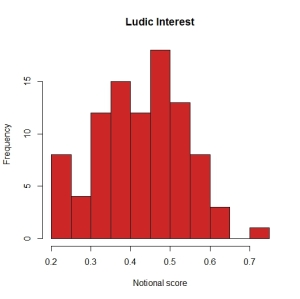
Which creates a new array of values(rounded to two decimal places) between zero and one (where one = “true gamer”), then plots the results in a histogram thus:

hist(ghb$ludicity)

Not entirely “normal” but getting there, with a positive skew, but nothing too dreadful. A set of data I can work with.

Or can I? Because when I look at the values in the vector itself I find that a small number of values are coming up “NA”. Whats going on? It turns out that some respondents didn’t select any of the categories for some of the games. And if they miss out just one game, their Ludic Interest value is screwed. It’s not too bad for this vector, but I can only assume there are other questions, where other respondents have chosen not to select an answer. And I try to correlate those vectors with this one, more and more answers will come up “NA”.

What should I do? The easiest thing to do would be to remove any respondent who has has any missing data:

> newdata <- na.omit(ghb)
> dim(newdata)
[1] 94 90

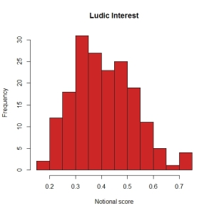
And bamm! At a stroke my sample size tumbles down from 193, to 94. How badly will that effect my analysis? Lets redraw that histogram with the reduced dataset:

hist(newdata$ludicity)

Hmmm, a bit more comb-like, almost bi-modal. Worrying.

So, can I deal with the missing data in other ways, changing it to zero for example? That might be (just about) acceptable for converting the categorical data in this particular question into a Ludic interest score, but may not be acceptable for the other instances of missing data. Ohhhhh maths is hard!

Oh curse you, respondents! Why could you just have answered all the questions properly? And why didn’t iSurvey remove you when I asked it to strip out incomplete surveys?

This post on Stack Exchange is the most useful introduction I’ve discovered so far about the mysteries of imputation.  But I’ll leave that for another day. In the meantime, I’ll work with my 94 complete responses.
The CHESS Experience

Why haven’t I discovered this before? Last week an email from the Guardian Cultural network pointed me to a headline reading “Tell me a story: augmented reality technology in museums“. Now augmented reality articles are two a penny, but “tell me a story” had me intrigued. So I clicked through, and got very excited reading the stand-first, which said “Storytelling is key to the museum experience, so what do you get when you add tech? Curator-led, non-linear digital tales.”

“Non-linear”?! that’s a phrase very close to my heart, so I’ve spent all morning reading about the CHESS Experience project.

(Well I spent some of my morning thinking “Oh no, that’s what I wanted to do! How come Southampton University isn’t part of that project? Why didn’t I do my PhD at Nottingham? That’s where all the cool kids hang out, apparently.” But having wallowed in a bit a self-pity, I got back to reading.)

CHESS stands for Cultural Heritage Experiences through Socio-personal interactions and Storytelling, which sounds right up my street. And the project summary says “An approach for cultural heritage institutions (e.g. museums) would be to capitalize on the pervasive use of interactive digital content and systems in order to offer experiences that connect to their visitors’ interests, needs, dreams, familiar faces or places; in other words, to the personal narratives they carry with them and, implicitly or explicitly, build when visiting a cultural site.” This is all good stuff.

But actually the reality of the project so far doesn’t seem quite as exciting as I’d hoped. The “personalised” story in A Digital Look at Physical Museum Exhibits: Designing Personalized Stories with Handheld Augmented Reality in Museums, seems rather to be just two presentations of story, one for children (in which, for example, the eyes of the remnant head of a statue of Medusa glow scarily) and one for adults (wherein the possible shape of the whole statue fills in the gaps between the pieces).  A Life of Their Own: Museum Visitor Personas Penetrating the Design Lifecycle of a Mobile Experience, discusses visitors preparing for their visit by completing a short quiz on the museum’s website. When they arrive their mobile device will offer them a stories design for a limited list of “personas.” This isn’t personalisation, but rather profiling, as we discussed at The Invisible Hand. And the abstract for Controlling and Filtering Information Density with Spatial Interaction Techniques via Handheld Augmented Reality describes “displaying seamless information layers by simply moving around a Greek statue or a miniature model of an Ariane-5 space rocket.” This doesn’t seem to be offering the dynamic, on-the-fly adaptive narrative I was hoping for.

But its good stuff, none-the less, and there’s a great looking list of references which I want to explore. There’s also project participant Professor Steve Benford (who does little to disprove the theory that all the cool kids go to Nottingham). He’s a banjo-pickin’ guitar playin’ musician and Professor of Collaborative Computing, who among many, many other things has published a bunch of papers on pervasive games and performance, which I think my Conspiracy 600 colleagues might want to (need to) read.

Steve also provides the soundtrack for this post, which I hope you enjoy.

Vikings!

I went to see the Vikings exhibition at the British Museum last weekend. Having very much enjoyed Life and Death in Pompeii and Herculaneum last year, I had high hopes for this visit. I was disappointed. First of all, I don’t like the space. The Sainsbury Exhibitions Gallery is at the back of the Great Court, and feels like a long narrow shape, that isn’t helped by the partitioning in the introductory section. It didn’t cope well with even the early Sunday morning press of visitors. Museum staff urged us not to queue, but to bypass the visitors who’d elected to take an audio-guide. Of course bypassing the visitors meant bypassing the objects they were looking at. I’d assumed that we were being urged to go pass them, because there had been a sudden knot of visitors, and that we’d be able to double back when blockage was clear. In fact more and more visitors came in behind us, and we were carried along by the flow, with no real opportunity to return to the earlier objects. So I saw NOTHING in the first gallery, and maybe three objects clearly in the middle section, before tumbling into the final section where the (largest but actually least impressive) boat from Roskilde was displayed.

By Odin, I grew to hate the audioguides! Their users huddled, immobile, in front of most objects, obscuring them from view. The devices themselves appeared to be Samsung phones, in a “don’t steal me” case, and as I stood admiring the backs of a family of visitors, in lieu of the object they were looking at, I thought about the computing power in that device and how it might be used to moderate flow.

That device likely had the ability to know where it was, and to exchange data with and process data from any number of other devices and sensors in the the gallery. Rather than a scripted tour, here was a prime opportunity for an adaptive narrative, a program that could direct visitors’ attention to objects across the exhibit, spreading them out, and maybe saying less before offering the visitor the opportunity to move on when spaces are busy, and sharing more when they are quieter. In this age of Google and Facebook, its surely not beyond the wit of man to build a program that keeps family groups together and sends more independent visitors off on a journey of discovery.

That said, the interpretation wasn’t much cop either, nothing as splendid as the emotional story and insightful details revealed by the Pompeii exhibition (which surely must have been even more crowded, but enabled every visitor to get close to every object. The most enjoyable things were the quotes from the likes of Ahmad ibn Fadlan and his contemporaries placed high upon the walls (where thankfully I could see them) in vinyl lettering.

In short, I didn’t get my (wife’s) money’s worth. I can’t recommend it, unless you are really interested in Vikings. And if you are, I suggest you get chummy with somebody who works for sponsors BP, then you might be able to wangle a private view.